Friday, 11 September 2015

A2 RESEARCH WORK- Short film textual analysis

To understand the structure and science of short films, I watched some short films and analysed them.

PAPERMAN;
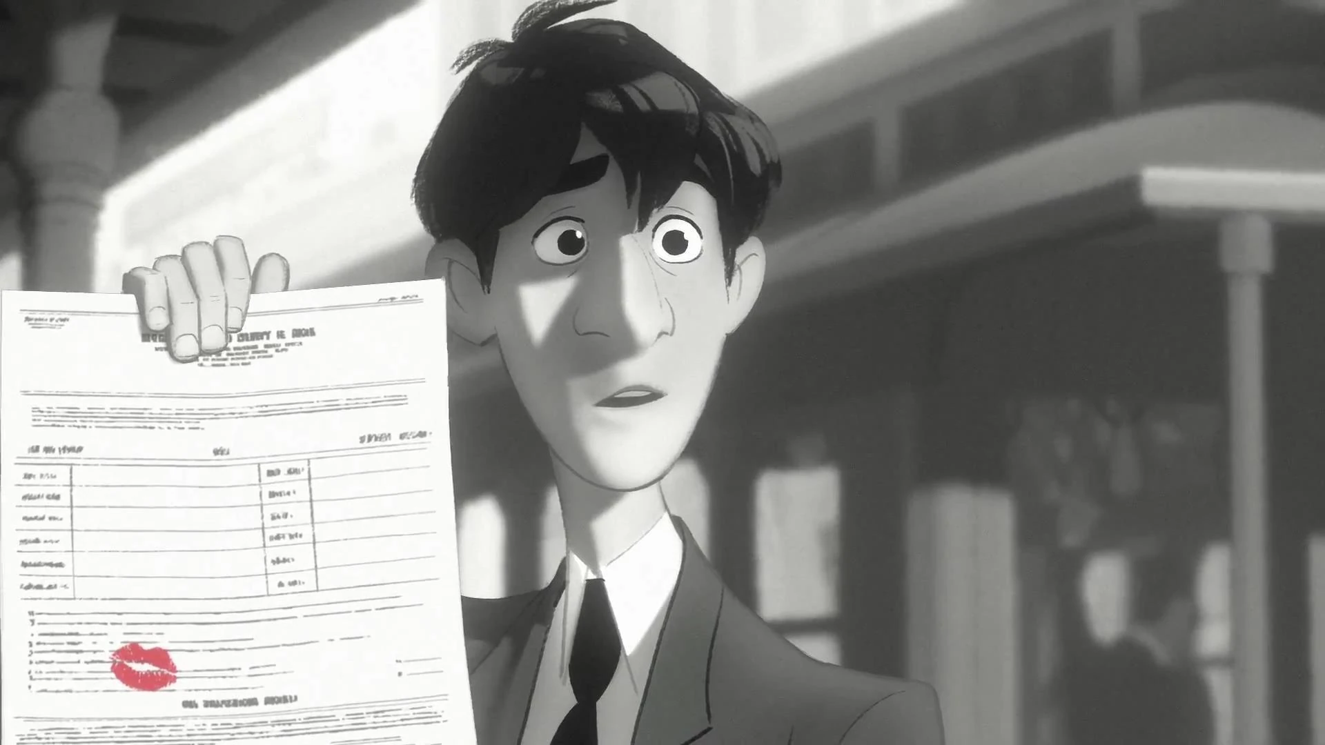
It is a 2002 6 minutes and 33 seconds long animated Disney film. It revolves around the character of a man who is shown living  unhappy and bored with his life and work, however one day he has a short encounter with a beautiful woman and gets attracted towards her, however later while working in his office he notices the woman in the office block opposite him, he tries to get her attention by making paper planes out of documents his boss just dropped on his desk, despite all the missed planes and increasing rage of his boss the paperman doesnt loses hope and keeps trying, suddenly hes out of paper and left with the last one that plays an important part of he story (has the womans lip stain) however determined to get her attention he gives up the last paper but all in vain as he misses this one too. He sees her leaving the office and runs after her but loses her again. Atlast paperman loses hope and starts walking on his way back however the paper planes guide them their way to each other and finally they meet. It is a black and white film and consists of mostly mid and long shots. It doesnot contain any dialogues however the sound effects successfully highlights the little details in the film e.g the starting scene where the boy meets the girl the change in music indicates his attraction towards her.

Thursday, 10 September 2015

A2 ADVANCED PORTFOLIO

The syllabus provides us with 4 choices for our advanced portfolio that are as follows
  1. Music promotion package
  2. Film promotion package
  3. Documentary package
  4. Short film package
I have opted for the 4th option i.e the short film package it requires us to produce a short film of the duration of 5 minutes along with a postcard advertisement and website related to the movie

Friday, 12 June 2015

critical evaluation AS

Q2)How does your product engage with audiences and how would it be distributed as a real media text.
Audiences play a very important role in the media industry every media product is planned, produced, edited in accordance with what the audience will prefer. before a media product is produced its target audience is determined i.e what group of people does the media owner want its product to be consumed by. My A level foundation portfolio consisted of a cover page , a content page and a double spread page of a fashion magazine. Before starting up with my magazine i had to plan everything out.Choosing the genre of your media text can be a difficult part however this issue can be resolved by determining the target audience for your media product . it is very necessary to determine for whom you want to produce the media product for. Before choosing the genre i carried out a research where i examined various magazines including celebrity gossip magazines , food magazines, travel magazines, lifestyle magazines, art/photography magazines, fashion magazines etc . i personally preferred either celebrity gossip, art or fashion to be the subject of my magazine.however keeping in mind my target audience that young women i chose them to be my target audience as being a girl myself i could relate more to their interests so, i circulated a questionnare among 30 women and chose fashion magazine as the genre for my project based on majoritys votes

Critical evaluation AS

Q1) How does your product use or challenge convention and how does it represent social groups or issues?
My A level foundation portfolio consists of a fashion magazine.We were required to produce a magazine consisting of a cover page, a content page and double spread page. We were allowed to chose whatever genre we wanted to, however there were certain aspects that had to be kept in mind while selecting the genre, the most important the target audiences. I took inspiration from a lot of leading fashion magazines, studied the trends the codes and conventions used to create the coverpage the centre spread and the content page. There are two types of codes that have to be kept in mind while producing a media project a) symbolic codes and b)technical codes. Symbolic codes consists of dress codes, colour codes and non verbal codes since i am making a fashion magazine i had to do everything in accordance with the fashion industry and since it is a womens fashion magazine it had to be feminine e.g the use of pinks and reds in the magazine. technical codes consists of all the technical work required for the media product i.e the camera angles, editing software etc .I kept in mind all these codes while creating my magazine, the colour codes used were mostly black, white, yellow and maroon.This were to indicate that it is womens mag. the non verbal codes such as the expressions and poses used were intented to reflect the title of the mag i.e saleeqa which is persian for manner/style, the cover page consisted of a closeup shot of the model making direct eye contact with the camera potraying confidence and grace.
Before starting i looked up several magazines to take guidance for all the stuff that has to be there in a cover page, content page and double spread page. the coverpage consists of a main cover image, a masthead, coverlines and a barcode.
The second step was to create the content page for my magazine. The content page must have the title of the magazine, the contents and coverlines must be present. The font and colours has to be catching. The colour schemes usually follow that of the cover page, and number of pages should be mentioned

the final step was to create the double paged centre spread for the magazine. it always features a main image that is according to the subject of the article, the heading is usually bold and large at top of the page, the article usually starts witha drop capital or a red dot to indicate where the article starts from, mostly a quote or tagline present in bold letters or a different font to make it stand out. The layout colour contrasts with that of the main image

Thursday, 21 May 2015

AS RESEARCH WORK; Double spread page

 Following are the double spread pages from leading magazines


                                                                                           What i learnt from them;

  • Always features a main image, according to the subject of the article, that is larger in size than other, if any, images present 
  • The heading is usually bold and large at top of the page
  • The article usually starts with a drop capital letter or a red dot to indicate where the article starts
  • Mostly a quote or tagline present in bold letters or a different font to make it stand out
  • The layout color contrasts with the main image
  • The magazine logo is present at either the extreme top or the extreme bottom of the page
  • page number mentioned at the bottom


AS RESEARCH WORK;Gathering ideas for cover story


                 Before starting a project that enquires large amount of input you need to have complete knowledge about the subject. according to the coursework i have to produce a center spread for my magazine that has to have articles according to the genre of my magazine i.e womens fashion so before starting working for my cover story i had to research about it , since the fashion trends are changing every now and then so i started everything a fresh the current fashion trends ,which ones are the most popular nowadays and how do such mediums create awareness about these trends, during my research i found all these images on the internet, when i started i had no idea what my cover story will be about however as i went through various articles i developed a lot of ideas for what i will be working on.                                                  
Apart from this i visited the sites of the leading brands of the industry as they are the prime trend makers


http://www.carolinaherrera.com/en/
http://www.chanel.com/en_US/
http://www.dolcegabbana.com/


I also looked up the sites of the leading women fashion magazines to discover their secrets and traits that make them stay at the top

http://www.vogue.co.uk/?international
http://www.elle.com/
http://www.marieclaire.com/


http://www.allure.com/


AS FOUNDATION PORTFOLIO- Final Double Spread


Wednesday, 20 May 2015

AS FOUNDATION PORTFOLIO- Final content page


AS RESEARCH WORK; Content page


The second step of the preliminary task was designing the content page of my fashion magazine so i started looking at the content pages of leading magazines
After studying these content pages i figured out about some of the basic things there have to be in a magazine content page
  • Magazine logo and title ( i,e contents) has to be present at the top of the page            
  •  Second titles present in different colours to make them stand out 
  • The colour and font used for the coverlines has to be eyecatching        
  •  Mostly consists of one larger image to draw attention towards a particular story e.g image of the person featuring in the cover story, sometimes more than one images are present
  • Colour schemes usually follows that of the front cover    
  • Number of pages should be mentioned